Monday, 16 July 2018

Visual Text Analysis Assignment about Visual Elements, PACC & Message - Kavin(16)


Image result for posters

Visual: Iron man and Ant-man are on the poster showing the size difference
Textual Elements and Typography: The main title is large showing the movie's name "Ant-man"and there is the sub-text which says "No Shield. No Armor. No Problem" which shows that Ant-man is not protected by any type of suit. However, he is not fazed by the challenge.
Purpose: the purpose is to promote the movie
Audience: For audiences able to watch PG13 movies
Context: Ant-man is a man with the powers of a suit to be able to shrink and grow
Culture: for everyone to watch the movie
Main Message: That ant-man is no ordinary super hero

Visual Text Analysis Assignment about Visual Elements, PACC & Message, by Ashley (3)


Visual: A neatly arranged poster with deers feeding on grass. This is to show how the expected result (from raising awareness) should look like - animals in their natural habitat feeding on their own food peacefully without any interference.

Textual: This poster is encouraging readers not to approach wildlife and say it in a very direct manner.

Typography: The title draws the readers attention as it is neat and big.

Layout: Direction of sight is from top to bottom. The simple colours of black and white makes it easy for the readers to read.

Purpose: To ask readers not to approach, follow or feed wild animals and to respect wildlife

Audience: General public, and mainly the people who feed wildlife

Context: Workers in the forest probably noticed that the public were feeding wild animals and knew that it was harmful to them. To raise awareness, they created this poster.

Culture: People may think that feeding the wildlife is good and benefits them as they need not hunt for food anymore. Some people may be curious and approach or follow wildlife. The company felt the need to raise awareness about this issue.

Message: Do not approach, follow or feed the wildlife.


Sunday, 15 July 2018

Visual Text Analysis Assignment about Visual Elements, PACC & Message By Serina (1)

Visual: There is a suit made up of newspapers in the middle of the poster. Since newspapers are commonly used by the homeless people, newspapers are used to craft the suit. The suit represents the jobs that the homeless people could do. 

Textual: The text is only a sentence which directly tells us the issue. It is short, succinct and direct.

Typography: The font used is easy to read. The colour of the font contrasts with the dark background to make the text stand out.

Layout: The newspapers are the same colour as the text, which does not make it stand out as much, so naturally, readers would read from the top to bottom. They would read the statement "A third of homeless people have been refused work because of their living situation." first. Then, they would see the suit made of newspapers to understand what the statement had actually meant.

Purpose: The purpose of this poster is for people to be aware that the homeless are not getting jobs due to their living conditions.

Audience: Employers and the general public.

Context: There are many homeless people around and having a job for them is important. Without a job, they would not make a living and it would not help their living conditions.

Culture: People think that the homeless people are not important and hence ignore them whenever they see them. 

Message: Help the homeless people as much as we can. It is unfair for them to be judged and not be hired for a job just because of their living conditions. Make a change in how we view the homeless people and it would really mean a lot to them.

Visual Text Analysis Assignment about Visual Elements, PACC & Message - Julius Kok(14)


Visual Text Analysis Assignment about Visual Elements, PACC & Message - Clarence (09)


Visual Elements: The logo and mascot of the channel are large and can be clearly seen. The objects on the shelf are random which gives the target audience that it is about anything.

Textual Elements and Typography: The Words are arranged such that they pull your eyes downwards. The name "Good Mythical Morning" and reads downwards which pull your eyes to the increasingly smaller words. 

P urpose: The purpose of the poster is to advertise about this podcast called "Good Mythical Morning" and to get more people listening/watching the podcast.
A udience: The target audience is the people who read the poster.

C ontext: Good Mythical Morning is a channel on YouTube hosted by Rhett and Link. They post podcasts and they talk about basically anything. They post every Monday through Friday.

C ulture: The culture of this poster is that the big orange fireball is the channel's logo and the chicken-dragon looking creature is their mascot.

Main Message: The main message of this poster is to advertise about this podcast on YouTube called "Good Mythical Morning" run by Rhett and Link where they talk about anything from Monday through Friday. They want readers to find out more about them and get more people to subscribe to their channel. 


Visual Text Analysis Assignment about Visual Elements, PACC & Message - Karl Steven (15)

Visual Elements:  There are 5 different people with their stance on either war/peace and whether they have served in the Army or not. 

Textual Elements and Typography: The words 'Never Served' are in Red which shows its negativity while the word 'Veteran'  in Blue which shows its positivity. The same goes for the background on the people.


P-  The purpose of this poster is the paint a negative picture of the people in red while painting a positive picture of the person in blue.

A- The audience is the people living in the US. 

C- The context of this situation is that there is an election ongoing and this poster is trying to alter voter opinion. 


C- The culture of this is that many people would want a Veteran to decide on military situations and that they would want Peace instead of War. This culture helps to paint a positive picture of the person in blue as he claims to want Peace instead of the other candidates who want War. 

Main Message: The main message of this poster is to consider voting for the 'better' candidate who knows about military procedure and mindset and believes in Peace, unlike the other candidates who are 'warmongers'. 

Visual Text Analysis Assignment about Visual Elements, PACC & Message - Naga Sai (7)


Visual Elements: The picture shows a man pointing towards the person reading it. It is pointing his finger towards the person to emphasise that it is talking to that specific person.

Textual Elements and Typography: All the words are in caps to show that this is a serious situation. The word 'you' is also in a bigger font and in a brighter colour so that it can attract people from a distance.

P- The purpose of this poster is to ask people to become recruits of the US Army
A- The audience is the people living in the US and it is for them to realise that they have to help their country in the war
C- The context of this situation is in war and it shows a person with a serious face which looks slightly scary so in my opinion, people might think that they might be haunted by this face if they don't go to the nearest recruiting station
C- The culture of this is to show people that their effort is required in order to win the war and every person counts.

Main Message: The main message of this poster is to encourage or force people to sign up for the U.S. Army

Visual Text Analysis Assignment about Visual Elements, PACC & Message, by Gwendolyn (6)

Image result for visual text

Visual: A cigarette box containing colourful crayons. That could mean that children are influenced by people who smoke around them, and they follow suit by putting their own crayons into cigarette boxes. This shows how children can be easily affected by the wrong things and yet not know it.

Textual: It asks the reader if you want 'them' to take after everything you do. The 'them' refers to the children as we can see in the image. This question is rhetorical and it suggests that no one should want children to take after all that adults do, especially referring to the wrong things that they do. Then, at the bottom of the poster, it says, quit today. This means that the main problem this poster wants to focus on is on smoking.

Typography: The font used was readable yet looks like it was drawn using crayons. This matches with the theme of children and crayons and the main message of the poster is written at the top of the poster. Our reading view would be from top to bottom, hence that is why at the bottom right of the poster, the main pointer that the poster would want us to remember is simple, short, succinct and straight to the point. It tells you exactly what it wants you to do, which is to quit smoking.

Layout: The main picture is placed in the middle and biggest, which will attract your attention more than the wordings since pictures speak a thousand words. Then, the reader will read the word title at the top, followed by understanding the picture and words, then finally moving on to the finer print words which will end the read of the poster with them remembering the simple message to 'quit today'. Also, the background of black contrasts with the pale white colours of the picture and the words, with the only colourful and alive part of the poster being the crayons of the children. This lets us see how the way we conduct ourselves may be dark and grey, but we should not let that spread to our children who have bright futures.

Purpose: The purpose of this poster is to ask readers to stop smoking or to raise awareness to other smokers to stop smoking. The poster shows readers what could happen when we smoke, especially if parents smoke or if adults smoke in front of children. This could affect or influence young children to become like their parents.

Audience: The main audience is the general public, people who smoke and have children around in their life. The poster also welcomes people who want to spread and raise awareness about this issue.

Context: The current problem faced is that there are many people who smoke in public places and without a thought for others, especially when children walk past, they would slowly pick up the information and might develop a similar attitude and start to smoke, which is bad for their health and future.

Culture: Many people who smoke in public think that they are not doing anything wrong, especially since it is not against the law to smoke in certain public areas. They think that what they do is not wrong and hence they continue to do so, without realising how they affect people around them who breathe in secondhand smoke. They also do not think about what children might think when they see that many people are smoking, and have a chance of picking up smoking as well. This is very inconsiderate of them.

Message:  Quit smoking today so that you would not influence your children and the future of their lives.


Visual Text Analysis Assignment about Visual Elements, PACC & Message : Dhruv (10)


In red:BUT MARINE ANIMALS AND BIRDS DO

In white (under red):100,000 MARINE BIRDS AND ANIMALS ARE KILLED EVERY YEAR FROM PLASTIC WASTE

Textual: The text uses words like "DOESN'T"
to show the message boldly
Visual: The pictures show the things talked about in this poster.
Typography: The title is large and in perfect with the background to catch people's attention.
Layout: The main message is the largest to show importance and then the information and details
Purpose: Is to try to encourage people that plastic can heavily harm marine animals and birds.
Audience: General Public
Context: People often overuse plastic.
Culture: People in Singapore generally do truly understand how deadly plastic can be.

Message: This poster is trying to encourage people to use less water.

Visual Text Analysis Assignment about Visual Elements, PACC & Message By Ivan

Visual: The posters shows food being thrown away, with money in the forms of coins being thrown away too. I think what the poster is trying to convey visually is that when we waste and throw away food, it is equivalent to wasting and throwing away money.

Textual: The text "When we buy, order or cook too much food, we waste our hard-earned money." shows that the food we waste is equivalent to wasting money. The poster also gives us factual information on how much food we waste like "On average we generate 2 bowls of food waste a day." and "786 million kilograms of food waste was generated in Singapore in 2015." to show to the reader the severity of the amount of food we waste, so they will be willing to change and stop food waste. 

Typography:  The text "Waste less. Save more." is enlarged and has a big contrast against the background to catch the readers attention from far, so they will go on to read more. The number "786 million kg" is enlarged to catch the readers attention so they will notice the severity of the amount of food we waste.

Layout: The heading of this poster is placed on the top of the poster as people usually read from the top down. The pile of food waste is placed in the centre of the poster to create emphasis on food wastage. Other information is neatly placed around the poster to make it easy to read.

Message: The message is that we need to stop buying more than we can eat, as that will generate food waste, and the food we waste is equivalent to the money we waste. 

Purpose: To inform the readers about the large amount of food we waste, and to persuade the reader to waste less food.

Audience: General public.

Context: Singaporeans are buying more than they can eat, therefore they waste food. This food they waste is equivalent to the amount of money they waste buying the food.

Culture: People think that it is alright to waste food as it does not impact themselves.


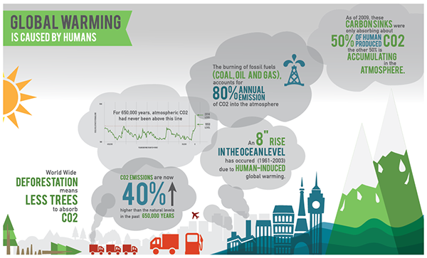
Visual Text Analysis - Sylvester Koh (24)


Visual: The data is presented in bad gases like carbon dioxide, and in dark colours to show that the environment has been getting from bad to worse. The harmful gases are from cities and forests and factories to show that these are the main contributions to the adverse change to the environment.

Textual: Terms relating to Earth, like "ocean", "atmosphere" used to show that what the humans have been doing really makes a significant impact to the environment. Also, the term "CO2" which stands for carbon dioxide is used to show that the amount of harmful gas we have been releasing is really impacting the environment, to make things worse, deforestation which means "less trees to absorb CO2" as mentioned in the text.

Typography: Keywords in the "bad gases" such as the causes of the adverse change and the change in statistics like percentage increase are larger to show the drastic changes and what we have been doing that made a significant impact in our environment. 

Layout: The main statistics are presented like clouds and are placed in the sky. Some of the words that are key are enlarged. 

Purpose: To inform people of the drastic changes in the environment, and trying to persuade them to make the change so that the environment may be improved.

Audience: General Public

Context: The amount of Carbon Dioxide has been increasing lately which contributes to Global Warming. A key reason is that of human activities like the burning of fossil fuels for electricity. Therefore, through designing this visual text, the creator hopes to advocate on this issue and persuade them to take action on the issue.

Culture: Many people think that the environment wouldn't turn that bad so these people don't take action regardless.

Message: The poster is to encourage people to take action on the recent changes in the environment.