Wednesday 22 August 2018

Michel Dominic John (20)

Related image
Visual: The visual is big and catches people's attention first. The visuals show us show us a thumbprint, which goes along with the text appropriately. A thumbprint is something unique to all of us and cannot be replaced, lost. It gives us our identity, and no one else can steal it.
Textual: The text is the first thing read after being read. The text says Be yourself; everyone else is already taken. The visual goes really well with the text as a thumbprint is who you really are, and you should be like your yourself. You are unique, and why copy others when they are all acting like themselves. So you should also act like yourself, or else people will know that you aren't yourself. 
Typography: The text is in cursive and relatively big.
Purpose: To tell that you shouldn't copy people and their behaviour to be more popular, liked by other people because you are unique and you should be yourself, or else people will know that you aren't yourself.
Audience: General public, people who keep acting like others.
Culture: For people to act on this meaningful quote.
Context: Many people these days are trying to be more liked and favoured by copying other people.
Sunday 19 August 2018

Skyler Cheng (23)

Image result for poster


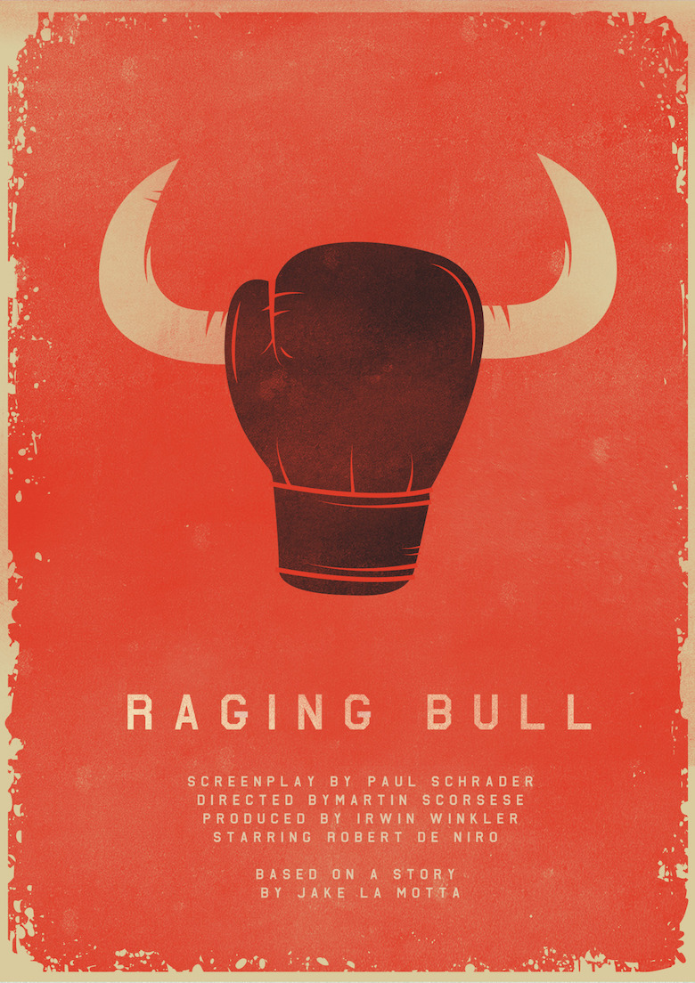
Visual: a boxing glove with two horns on the side to look like a bull.
Textual: The title of the film followed by the credits in smaller fonts.
Typography: The title draws the readers attention as it is neat and big.
Layout: the large image draws the readers attention to it first, followed by the title then the credits
Purposeto persuade readers that there is an interesting film for them to watch
Audience: general public
Context: The story of a middleweight boxer as he rises through ranks to earn his first shot at the middleweight crown. He falls in love with a gorgeous girl from the Bronx. The inability to express his feelings enters the ring and eventually takes over his life. He eventually is sent into a downward spiral that costs him everything.
culture: for people to watch the film

Message: a bad relationship would affect you badly.


Wednesday 18 July 2018

Jin Zi Yue 12

Visual: This poster tells us the importance of reading. It shows a man with words in his head, words that mostly come from books. At the bottom, you can see a quote that highlights the importance of reading books.

Textual: The text compares the mind and books to the sword and the whetstone. The whetstone is a slab of rock that is used to sharpen swords and tools, or weapons for war. The mind is like a sword; the books are the whetstones. The slogan is trying to tell us that reading more books will sharpen your mind.

Typography: The slogan is a whitish yellow color, and it is in contrast to the red background of the poster, drawing attention. The words are also quite big, which makes it eye-catching and more comfortable to read from a distance.

Layout: The person's head is displayed above to grab the reader's attention and arouse curiosity, then the reader will read the words at the bottom, and they will sort of have an answer, understanding the poster better.

Audience: The general public, especially students and young adults/teens.

Context: The purpose of the poster is to highlight the importance of reading and make people aware of the benefits of reading, thus encouraging the people to read more books.

Culture: As our world is transforming into a more electronic one, more people will turn to their mobile devices and search up an answer or an article on the web and read there. The people read less and lesser books. Thus, the importance of reading books and the knowledge you gain needs to be highlighted, and therefore this poster is created.

Message: Reading books is essential, as it sharpens your mind and expands your knowledge.

Tuesday 17 July 2018

Visual Text Analysis (Dean)(21)

Visual: The image shows us that we have to be kind to animals and not leave them alone to hunt for food by themselves.
Textual: The texts are generally stating that Animals are being abused each day and that we have to do something about it.
Typography: The words "Be Kind to Animals" is the main words which tell us that we have to stop animal abuse and be kind to them and not leave them out by the roadside.
Layout: The title is at the top, followed by a picture with someone with a dog eating the food given by the person and with a sentence which tells us the company who promotes the kindness to animals.
Purpose: To encourage people to be kind to the animals and stop hurting them.
Audience: Every human being in the world.
Context: Many animals do not have homes, and they are left by the roadside with no food to eat.
Culture: Some people are cruel to animals by beating them up or throwing stones at them.
Message: Be Kind to Animals.

Visual Text by Levi (19)


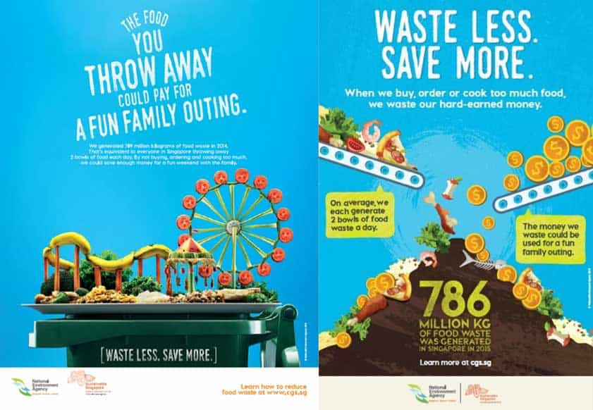
Image result for stop wasting food hpbVisual: The image on the left side of the poster shows an amusement park represented by food waste. This shows that the food wasted cost enough to get a ticket to a cinema. The image on the right side of the poster shows money and food waste being dumped onto the same pile of trash. This shows that when we waste food, we also waste a lot of money.
Textual: The texts are generally stating that food waste also equals to hard-earned money wasted.
Typography: The words "Waste Less, Save More" are the most obvious and common words that are visible and the one on the right side is in large font size. This attracts attention from people as they would ponder what the phrase is referring to.
Layout: The words are at the top and the pictures are at the bottom and some words are in the picture.
Purpose: To encourage people to stop wasting food in Singapore.
Audience: Singaporeans and general public
Context: Many people in Singapore generate food waste daily. Thus, we need to stop food waste as we will also lose money through food waste.
Culture: Some people order too much food that they end up wasting.
Message: Stop wasting food.

Visual Text Analysis- Aisya ( 02 )


Visual: In the centre of the poster, a slogan stating, 'Pick the white one.' Is surrounded by 4 bags of blood; all in the exact same shade of red. The packs represent the blood gathered from each of the 4 different 'colours' that humanity is separated into. 

Textual: The slogan mentioned is a rhetorical statement as there is no difference between the blood packs and there is certainly no white one. At the top of the poster, the main text is actually calling out to racists, getting them to imagine that their child needs donated blood and that they have to choose among the four identical packs. A footnote at the bottom also shows us the central message the poster is advocating about.

Typography: The central texts are large, bolded and white. This makes them stand out against the black background so that they are noticeable and eye-catching.


Layout: The large text at the top will catch the reader's attention first followed by the slogan in the middle and finally, the footnote. The design is simple and makes the poster easy to understand.


Purpose: The purpose of this poster is to encourage people to turn away from racism and accept others for who they are, instead of just by looking at their skin colours.

Audience: Racists, the general public who are able to spread the message by their own means.

Context: The population of racists is snowballing over time and, the Campaign Against Racism wants to stop that.

Culture: Under the influence of social media, government powers or pressure from either peers or family, more and more people are leaning towards the option of the racial segregation of mankind. Their views on people of different skin colours have been contorted to such extents that they see those that look different from them as threats to society. Campaigns are working to change that mindset and unite the people more.

Message: We are all the same no matter what we look like. We have to learn to look beyond just the surface as the same blood runs through all our veins.

Visual Text Analysis Assignment - Owen Wiyana(22)


Textual: The visual text is talking about the importance of storage in devices. It shows the percentages of how people store their information.
Visual: There is a big brain which stands out in the picture, it is cut up into different sections to show the percentages in a more interesting way. There are also many electronic devices related to storage on the poster to emphasize the importance of storage.
Typography: The biggest words on the infographic are the words "BACK IT UP" which emphasises the importance of backing up data.
Layout: The information is organised from the most important at the top and less important on the bottom. There are images which help to represent data in a more interesting manner.
Purpose: The message is trying to emphasise the importance of backing up information safely and what are the ways to do it.
Audience: People who own electronic devices used for work or storing important information.
Context: People are losing data due to not storing information correctly or in the right way, resulting in loss of important information they require for various reasons.
Culture: The creators of the poster want to empathise with people who lose data due to poor storing methods, thus they want to advocate the right ways to store data and preventing them from being lost.
Message: People should back up data responsibly to prevent important information from getting lost, possibly causing people to lose their jobs or destroy their lifestyles.

Visual Text Analysis Assignment about Visual Elements, PACC and Message- Jonathan Chua(13)

Image result for posters

Visual: The posters shows half a turtle that is alive while the other part of the body is dead and is showing the skeleton that is left. This shows that some turtles in the world are actually dead because of what mankind had done in order to make turtle products.

Text: The poster has a text which encourages us to stop hunting down turtles and preserve them.

Typography: The text has a very big word "STOP" which attracts the attention of people in order to persuade them to stop doing such acts on turtles.

Layout: The text starts from the top (the picture) to the bottom (the text).

Purpose: To ask readers to stop the act of hunting and killing turtles.

Audience: The general public and especially the people who are killing turtles.

Context: Many people in the world are killing turtles in order to make turtle products. In order to stop such activities, thus this poster was created.

Culture: Some people feel that we should not be doing this but they are not doing anything.

Message: To encourage more people to stop doing such acts and to preserve turtles`.

S1-01 Visual Text Analysis

Made with Padlet

Monday 16 July 2018

Visual Text Analysis Assignment about Visual Elements, PACC & Message - Jayden (8)

Image result for meaningful poster


Visual:
The polar bear is standing on a small icecap, and it could have been caused by global warming as the ice could have melted from the rising temperature. The polar bear is in red, suggesting that it needs help.

Textual:
The poster says that "global warming does not hibernate". This means that global warming does not stop and "hibernate", unlike polar bears. The black text below says the effects of global warming, especially on polar bears. The red text at the bottom is an imperative sentence, telling viewers to help stop global warming,

Typography: 
The text "Global warming does not hibernate" is the largest text, especially the two words "Global Warming". The viewer would then understand the purpose of the poster more easily.

Layout:
The picture of the polar bear is placed right in the centre so it will attract the viewer's attention first. The text "Global warming does not hibernate" is positioned below the picture so it will be the next thing the viewers notice. The details are placed at the bottom so the viewers would read it last.

Purpose:
It aims to get people to stop global warming.

Audience:
The general public

Context:
Global warming is happening, and it can harm many animals. The primary cause is human activities.

Culture:
People think that global warming is an issue but most of them are not doing anything to stop global warming.

Message:
This poster is trying to encourage people to stop global warming.


Group 4 Badge Night Speech Podcast

Link to podcast: https://drive.google.com/file/d/1grqeI1MxLvoEjlM_mZB1KZHd6-pahvGk/view?usp=sharing